My Online Art Portfolio

Wednesday, June 9, 2010

monet esc

Okay! So I've started on my monet-ish picture. I'm afraid that copious quantities of nasal drip and many other unpleasant cold-like symptoms have gotten in the way of me getting very much done on it, but here is what I have so far.

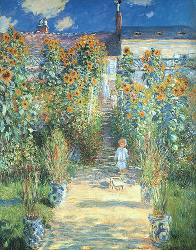
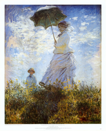
Oh. Did I tell you my experiment? On Monet? No? Oh-I'll will tell you. I picked out ten on Monet's paintings that I liked, and opened each in photoshop. With the eyedropper tool, I randomly picked ten colors from each painting. Matching it with prismacolor pencils, I made a sampler for each painting. See?


Here, I have separated each of the horizontal bars and stuck them onto each painting, so you can see and compare for yourselves. The reason for this experiment was to wrap my head around his color palette.


So what have I learned from this experiment, you ask? Plenty. For one thing, Monet rarely used pure black. He tried to avoid it, because really, if you look carefully, something that looks black is almost never really black.

Also, even though he had a wide color range, particular colors appear again and again in all of his paintings, such colors are: periwinkle, baby blue, henna, cream, limepeel, pumpkin, peach, and a dull olive green.

So without further ado, here's the start on my picture.
...and that's it for today. Check back for updates. Thanks for stopping by!

Tuesday, June 1, 2010

third wolf portrait completed!

Over the long hours between the hot afternoon and the memorial day dinner to be had, I found time to finish my third wolf macro. In the end, I burnished everything-crisped up the edges of his fur, which I had accidentally blurred with my clumsy hand, and I added a lot more colors to his forehead and face in general (yes, it is a he, don't ask me what makes me think so, I haven't the foggiest).

So, anyway, here he is. This guy seemed the hardest of all three for some reason. I think getting the hang of the contrast was more difficult on this one.


*She sighs as she sits back*. Now that that's done, I was thinking of doing something with people in it-an actual scene and not so much a portrait.


I've been an avid admirer of Monet since...since always, actually.


I love his soft but realistic color palette, that often includes as much moody darks as airy pastels. The floaty blurriness of the paintings somehow seem more realistic- to echo the way fast moving life looks than a photo-crystal clear painting.


I have some photos I took of Lewis Ginter Botanical Gardens two years ago with my sister, her daughter and a friend walking about the gardens' many paths, and I got to thinking. I think I'm going to try a Monet-esc painting. Nothing madly sharp and perfect-airy and watercolory and pastelly.Will it be a toss, or a keeper? We'll see how it goes.