My Online Art Portfolio

Saturday, May 29, 2010

update on 3rd wolf

Here's a bit of an update. My art room was eight thousand degrees-which is unfortunately where the computer and all the art supplies were-so moving it wasn't really an option. But I did get some done.

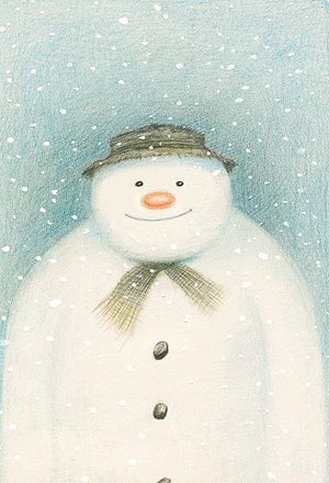
Today I wanted to talk a little about burnishing. It's when you've laid down several shades of pencil color on paper, and the tone looks good but the texture is, eeewwcch. It might be grainy. It might be a little uneven. The thing it is not is smooth. That's where burnishing comes in. After you've made your layers, you take a lighter, neutral colored pencil that is going to not or only alter a little the general color you've tried to achieve on the paper. You sharpen that pencil, and, sharpening it often to keep it to a fine point, you press very firmly and evenly (not too firmly-you don't want to rip the paper!!) until you have actually pressed down the tooth or fuzziness-the texture of the paper essentially. What this achieves is a polished, finished, smooth look. Some colored pencil artists like their work more burnished than others. Some don't burnish at all! But usually a great majority do, unless you're going more for the "Snowman by Raymond Briggs" effect, which isn't a bad thing.


Anyway, below I have some progress pictures as I work through layering and then burnishing the background.

You'll notice that I tend to add a lot of pinks and purples. Girly me.


Starting to put in the background near his left ear.


More of the background layering.


I'm getting kinda crazy with the pastels, but bear with me-blues and purples tend to make whatever they're coloring go back visually. Think about when you see blue mountains in the distance.


Ahh, now the burnishing. Do you see it?
The little bit that I've started, using a
light gray pencil?


What? You don't see it? Here, I'll put a red circle around it.

This does take time, but if you want the effect, it is worth it. I burnish all of my pieces. Keep in mind that once you burnish an area, it is very, I repeat, very, tricky to get any more pencil on top, and I don't reccommend that you try. You're going to end up with a smooth patch with what looks like a three year old scribbled on top unless you're very careful. It also really depends on how much tooth the paper you're using has, too.


Now I've burnished that whole background bit. Doesn't it look better?


I also darkened up the wolf's features a bit, he was not quite sharp enough for my taste.


And here's where I am so far. Now, all I really need to do to finish this up is to do the upper right corner and his furry shoulder on the lower left corner and then I can call it done.

Hope this helped you other colored pencil artist newbies out there! Have a happy memorial day weekend!

Wednesday, May 26, 2010

first post


Hi! You may or not have read my About Me profile at the side of the blog-but regardless, you should know that this blog is going to be about my art projects, namely, ones made from acrylic paints on canvas and colored pencil drawings on paper.

It's also going to be about the progress and steps that I make as I go from initial idea to rough sketch and from the vague start of a work to the completion, or in some rare cases, a complete toss out, if the idea was never meant to work!

It's about me stretching my horizons as a curious and ambitious artist-about my methods and how I work them-the supplies I use, the artists I admire, what can be learned from them...

...essentially...this blog is about...wait for it...ART. Really and truly.

My portfolio is at this website if you want to have a closer look at my past and present works.

So onward from that-I've been working on wolf macros-you'll probably have seen that I stated in my profile that animal macros are among one of my favorite kinds art projects.

These are no exception. I've made two, as you can see-and I am working on a third.


As for all of my colored pencil projects, I've use/been using Prismacolor pencils, just the original kind, not extra smooth or anything different. I've also been using a graphite pencil, for marking out where the facial features are supposed to be, and the smooth side of water colored paper.

For those out there who don't know-water color paper is generally used for water color painting. But it so happens that it works for colored pencil-and I happen to like it quite well-but I do use the smooth side, as opposed to it's coarse side. Some people like it, but me, arrrrrerrr, too grainy of a finish for my tastes.

And, of course, I always have a photo (or several!!) photo references to follow. How closely one follows it is entirely up to the artist. I generally try to make a close likeness, but go a little wild on the colors, and make the drawing more contrasted than the photo really is, so that the subject really pops at you.

I get my photo references from wetcanvas, where you can search their photo reference data base and use any of the photos without having to pay royalties or credit to the photographer, and you may sell the finished art piece.

I use Flickr sometimes, but it's more tricky-even with the creative commons liscensed photos, because even then, you may still have to credit the photographer, which is difficult if you plan to sell your finished piece. Better to go ahead and pick out the photo you like, and send the photographer an email or flickrmail asking permission.

Or, if you're handy with the camera, just get out there and take some photos of subjects you're interested in! Usually, as you might have guessed, I do all three. Just make sure whatever you do, you have the permission-whether it be permission to take a picture of someone's dog, a photo from flickr, or any other source you're unsure about.

I think that's enough for today's post. Check back for my progress on my third wolf portrait, and thanks for stopping by!